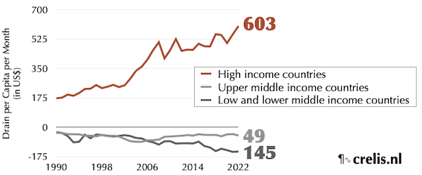

The Decoupling Delusion
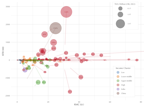
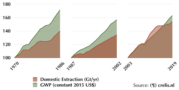
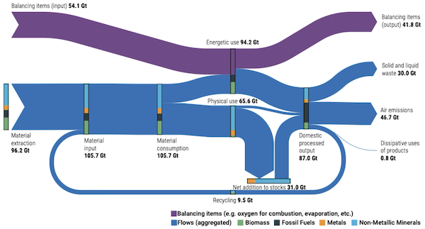
Money is a human invention, unbound by physical laws—it can be created or destroyed at will. So could economic growth continue even if physical expansion stalls? The concept of “decoupling” suggests it might. The figure conceptualises what decoupling would hypothetically require. Model A assumes endless economic growth (red), even as physical activity (blue) plateaus. This demands that the non-physical sector (purple) dominate, approaching 100% of economic activity. First of all, empirically we see that the economy is becoming more resource intensive, not less. But even if we could change course, thermodynamics imposes hard limits: every process involves losses, dissipation, and degradation. Recycling requires more energy generation, which requires material resources, which also degrade over time. No matter how efficient we become, finite resources and thermodynamic constraints will eventually cap growth. Model B presents a more realistic scenario: non-physical growth is capped, allowing only modest decoupled growth before levelling off. Preparing for a post-growth world isn’t just wise—it’s inevitable.
Murphy Jr, T. W. (2022). Limits to economic growth. Nature Physics, 18(8), 844-847.