Five Netherlands

The Netherlands has a significant land-use footprint, primarily driven by imports. Despite the country’s total surface area of 4.2 million hectares, which includes inland and open water, only 2.0 million hectares are dedicated to arable land, permanent crops, and pastures for agricultural and forestry activities. However, the Netherlands supplements its limited domestic land with a staggering 20.3 million hectares of imported land use. When taking exports into consideration, the net trade land-use expands to 18.8 million hectares. Overall, the Netherlands’ total land-use footprint reaches 20.8 million hectares, which is more than five times its own surface area! This extensive footprint illustrates the heavy reliance of the Netherlands on international land resources to sustain its economy and population, surpassing the capacity of its own land.

Data source: UNEP (2024). SCP-HAT database v3.0. UN Life Cycle Initiative, UN One Planet Network, UN International Resource Panel. Paris. https://scp-hat.org/methods

A ridiculously low poverty line

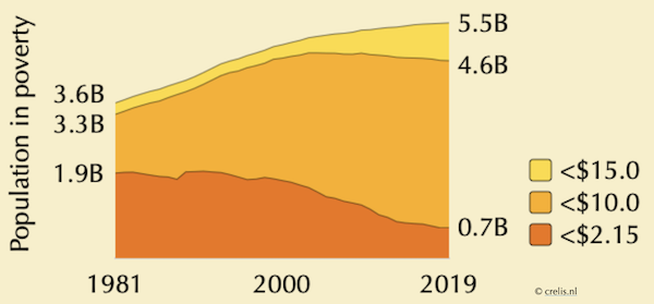
It’s easy to feel reassured by the narrative that global poverty is shrinking, especially when we hear, e.g., that the number of people living on $2.15 a day dropped from nearly 2 billion in 1981 to 702 million in 2019. But let’s be real—surviving on $2.15 a day is a far cry from actually living. A healthy diet alone requires about $6.9 per day, and some argue that an escape from poverty happens closer to $10 or even $15 daily. At those levels, the picture is far more alarming, with billions still trapped in poverty, despite the so-called progress of global capitalism. It’s time to stop celebrating superficial victories and start addressing the real needs of people around the world.

Data source: World Bank (2024), Poverty and Inequality Platform (version 20230919_2017_01_02_PROD) [data set]. pip.worldbank.org. Accessed on 2024-02-23

The feeble decoupling of emissions from growth

Recent self-congratulatory absolute decoupling of emission from economic growth in high-income countries falls far short of meeting their fair share of the 1.5°C global carbon budget. The graph below shows actual data and future scenarios for consumption-based CO2 emissions (as percentages of 2022 levels) for 11 high-income countries that have achieved absolute decoupling, along with their population-weighted average. Dark grey lines represent data from the decoupling period (2013-2019), while light grey lines cover the recession and rebound period (2020-2022). Dashed red lines project future emissions under a continuation of the 2013-2019 GDP growth and decoupling rates (business as usual), while dashed blue lines depict emissions pathways that would keep these countries within their fair share of the global carbon budget, offering a 50% chance of limiting warming to 1.5°C (not great odds, but let’s go with it). Conclusions? At current rates, these countries would take over 200 years to approach zero emissions, emitting more than 27 times their fair share of the carbon budget! To meet the 1.5°C target while maintaining economic growth, decoupling rates would need to increase tenfold by 2025. Hypothetically, if these countries manage such an energy transition (against the odds), the world would quickly run up against mineral resource limits, leaving other countries without the resources needed for their own transition. Growth is the problem.

Source: Vogel, J., & Hickel, J. (2023). Is green growth happening? An empirical analysis of achieved versus Paris-compliant CO2–GDP decoupling in high-income countries. The Lancet Planetary Health, 7(9), e759-e769.

A homework assignment for “green growthers”

Green growth proponents continue to produce flawed graphs that claim to show the decoupling of emissions from economic growth. These graphs are repeatedly critiqued, but the critiques are ignored, leading to a cycle of misleading representations. The latest iteration, now circulating on Dutch social media, is no different (see bottom-right graph). Instead of repeatedly doing their homework for them (again and again and again), let’s give green growth advocates a clear assignment: create a graph for the Netherlands—or better yet, for multiple high-income countries—that accurately compares emissions to economic growth (or even better, compares growth to various pollution flows and material resource uses). This graph should reflect historical and consumption-based data (so first, learn what this means), include all sources of environmental impact (don’t forget land use, air, and freight transportation), and ensure data transparency. It should also compare the results with global targets and fair-share responsibilities. Your grade will depend on how far back your data goes, the completeness of your sources, the range of material pressures included, and your engagement with the latest scientific literature.

The rich get richer, not happier

Neoclassical economists wrongly assume we always want more, but reality shows that beyond a certain point, more income doesn’t bring more happiness (the so-called “Easterlin Paradox”). The graph below plots 2021-2023 averages of incomes against levels of happiness (each dot represents a country). In fact, obsessing over wealth can make us less happy, burdening us with stress and alienation. Intentionally reducing consumption or setting sufficiency caps—choosing “enough” over excess—can be liberating, much like breaking free from an addiction. And that’s not even touching on the environmental benefits of embracing a sufficiency cap!

Based on the following data:
Helliwell, J. F., Layard, R., Sachs, J. D., De Neve, J.-E., Aknin, L. B., & Wang, S. (Eds.). (2024). World Happiness Report 2024. University of Oxford: Wellbeing Research Centre. https://worldhappiness.report
World Bank (2024). World Development Indicators. GDP per capita (current US$). https://data.worldbank.org/indicator/NY.GDP.PCAP.CD?end=2023&start=2021

The “Great” Correlation

The global economy has consistently grown over the past 60 years, with an average annual increase of 3.5% measured as Gross World Product (GWP) in constant 2010 US dollars. This growth rate implies a doubling of the GWP every 20 years. The GWP started at around $11 trillion in 1960 and has risen significantly to nearly $90 trillion in 2022. Economic growth has gone hand in hand with growth in global primary energy consumption (fossil fuels, renewables, nuclear). The strong correlation coefficient (R=0.9) between GWP and energy consumption highlights a robust linear relationship, indicating a “great correlation” between economic fluctuations and energy usage. During economic upswings, energy consumption increases, while downturns, such as financial crises or pandemics, lead to reduced energy usage.

Impacts of minimum access

This graph illustrates the impact on Earth’s systems in 2018 if everyone had minimum access to food, water, energy, and infrastructure. Instead of using the international poverty line, the study defines ‘just access’ as the essential needs for a dignified life (level 1) to those that enable escape from poverty and vulnerability (level 2). The findings are striking: achieving these access levels would boost greenhouse gas emissions by 26% and increase water and land use, along with nutrient pollution, by 2-5% on top of current pressure. It’s important to realise that the pressures from the poorest third of humanity getting adequate access are equal to those caused by the wealthiest 1-4%. This highlights that for true social and environmental justice, the wealthy, who consume the most resources, must make transformative changes.

Source: Rammelt, C. F., Gupta, J., Liverman, D., Scholtens, J., Ciobanu, D., Abrams, J. F., … & Zimm, C. (2023). Impacts of meeting minimum access on critical earth systems amidst the Great Inequality. Nature Sustainability, 6(2), 212-221.

A Mount Everest every 20 months

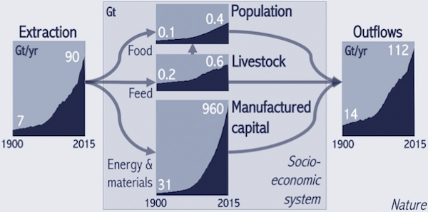
In 2015, global production systems used 90 gigatonnes (billion tonnes) of natural resources and discarded 112 gigatonnes as waste and energy. To put this in perspective, the world economy processes resources equivalent to an entire Mount Everest every 20 months. This is a result of an expanding process. The global economy involves the inflow, outflow, and accumulation of resources, all of which are experiencing exponential growth as you can see from the graph. Looking ahead, the United Nations Environmental Programme projects resource consumption to reach 184 Gt per year by 2050 in a business-as-usual scenario. This means a Mount Everest of resources every 10 months! Even under a high-efficiency scenario, resource consumption is expected to rise to 132 Gt per year by 2050, representing a 43% increase from the current level.

Source: Krausmann, F., Lauk, C., Haas, W., & Wiedenhofer, D. (2018). From resource extraction to outflows of wastes and emissions: The socioeconomic metabolism of the global economy, 1900–2015. Global environmental change, 52, 131-140.

Running out of metals

The “green transition” is not green. Mining for essential minerals already inflicts significant environmental damage, and this damage will likely increase as extraction rates lag behind what is needed. For example, we need approximately 4.6 billion tonnes of copper to replace just one generation of renewable energy infrastructure. However, the current annual production is only around 24 million tonnes. At this rate, it would take about 190 years to achieve the necessary copper supply, which would require a significant increase in production and its associated environmental consequences. Compounding the issue, global copper reserves currently stand at about 880 million tonnes, enough for only 30 more years of production, covering just 19% of the requirement for one generation of renewable infrastructure. The situation is even more dire for other critical metals. While copper recycling rates are relatively high, they are insufficient for many other essential metals. The reference below delves deeper into these critical limitations.

Source: Michaux, S. (2022) The quantity of metals required to manufacture just one generation of renewable technology to phase out fossil fuels. JKMRC Friday Seminars 2022.

Under the floor or above the ceiling

We must avoid overshooting environmental ceilings (climate, biodiversity, etc.) while ensuring we meet social floors (food, education, etc.). But who constitutes “we”? This graph illustrates the average extent to which ceilings are overshot (horizontal axis) and floors are achieved (vertical axis). Ideally, countries would reside in the top left corner, above the floors and below the ceilings. Circles depict performance at the end of the analysis period, with paths indicating their starting points and sizes varying according to population. Global North countries fall into the low social shortfall and high ecological overshoot group, increasing their ecological overshoot to 350% beyond fair shares of the ecological ceiling on average. Meanwhile, global South countries in the high social shortfall and low ecological overshoot group show an ecological overshoot of 19%, on average. Although no countries eliminate shortfalls without overshooting ceilings, the encouraging news is that several countries manage promising trajectories, such as Costa Rica, Jordan, Albania, and Mauritius. How do they achieve this balance?

Source: Fanning, A. L., O’Neill, D. W., Hickel, J., & Roux, N. (2022). The social shortfall and ecological overshoot of nations. Nature sustainability, 5(1), 26-36.