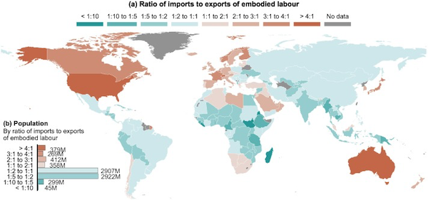
We know that global trade transfers human effort from the Global South to the Global North, but what does this look like at a more granular level? In 2018, for every full-time worker in the United States producing exports, the country imported goods and services equivalent to the labor of 7.3 full-time workers abroad. This made the U.S. the world’s top net importer of “embodied labour.” Other top net importers included Australia (net-importing 4.26 full-time workers), Luxembourg (4.43), Kuwait (4.51), and Hong Kong (5.23). Conversely, South Sudan exported goods and services equivalent to the work of 16.9 full-time workers for every one worker producing its imports. It was followed by Eritrea (net-exporting 15.6 full-time workers), Madagascar (13.9), Liberia (10.6), and Tanzania (9.3). You can check how this works out in your own country in this dataset. This imbalance is not random; it reflects a clear North-South divide, as illustrated by this map. The map also reveals that 6.2 billion people live in nations exporting more embodied labor than they import, while 1.4 billion reside in countries benefiting from net labor imports.
Leave a Reply